My Work — Portfolio Case Studies
At Fleetio, I built comprehensive design systems from the ground up — establishing foundational color tokens, scaling them into a complete component library, and engineering the front-end architecture that brought it all together into a cohesive brand identity.
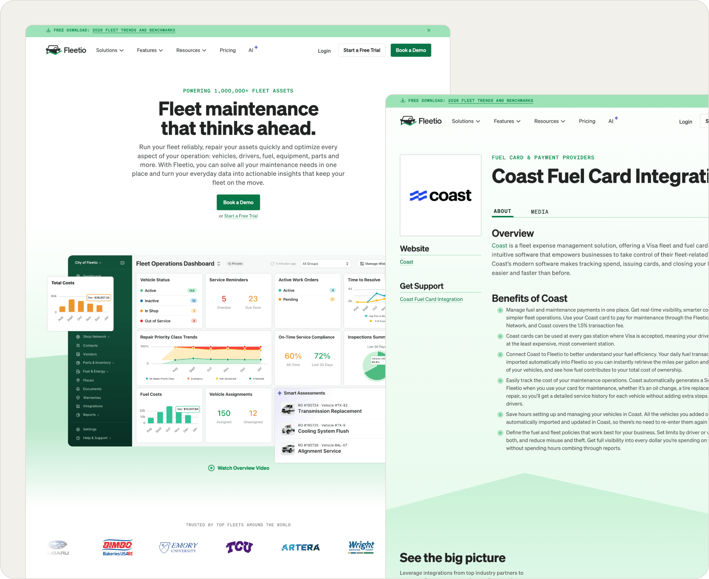
The pieces were there. The system wasn't.
Fleetio had color tokens. It had components. But they existed in isolation, without the connective tissue that turns a collection of assets into a living design system. Components in Figma weren't wired together, so a single brand update meant hunting down changes manually across dozens of files. There was no system for social graphics, no shared framework for new surface areas, and the Figma component library didn't reflect the actual props and variants available in code.
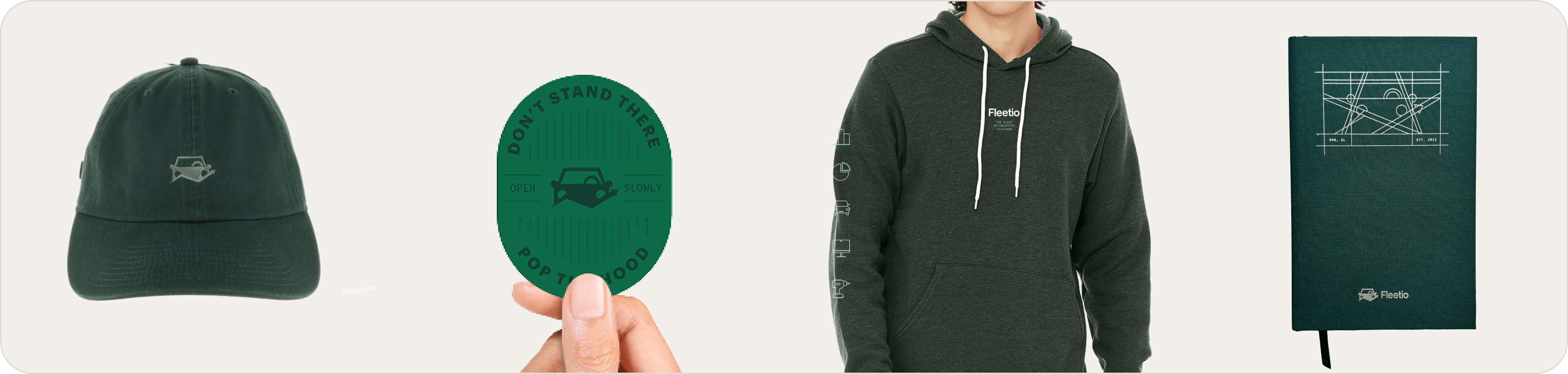
I came in to fix that. I unified the existing foundations, closed the gap between design and engineering, extended the system to cover every surface across all design assets and drove new design decisions that became part of the Fleetio brand going forward.
Building the foundation that everything else could stand on.
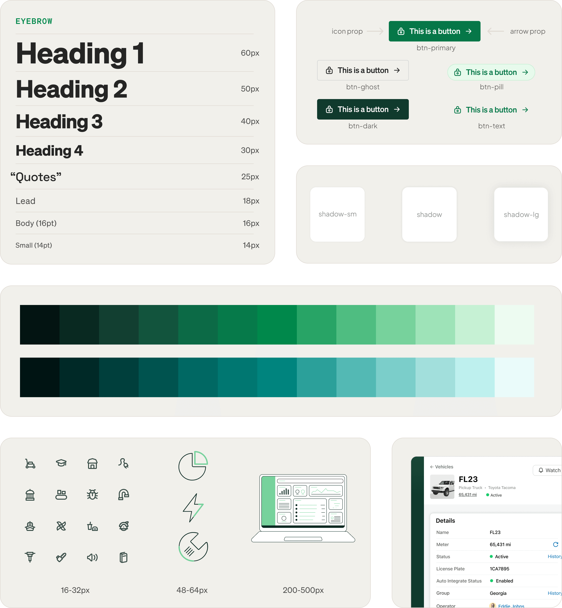
Before I could unify anything, I needed to establish a proper token architecture in Figma. Fleetio had no dark mode or mobile variables, so I built that system from the ground up for web, and translated our Tailwind class structure directly into Figma variables so that design and code were speaking the same language.
I created complete type style libraries spanning web, print, and social scales, so that typography decisions made in one context could inform all the others. I also built out component systems for each of our iconography families, with consistent sizing scales across every icon set. The result was a clean Figma that aligned with our website.
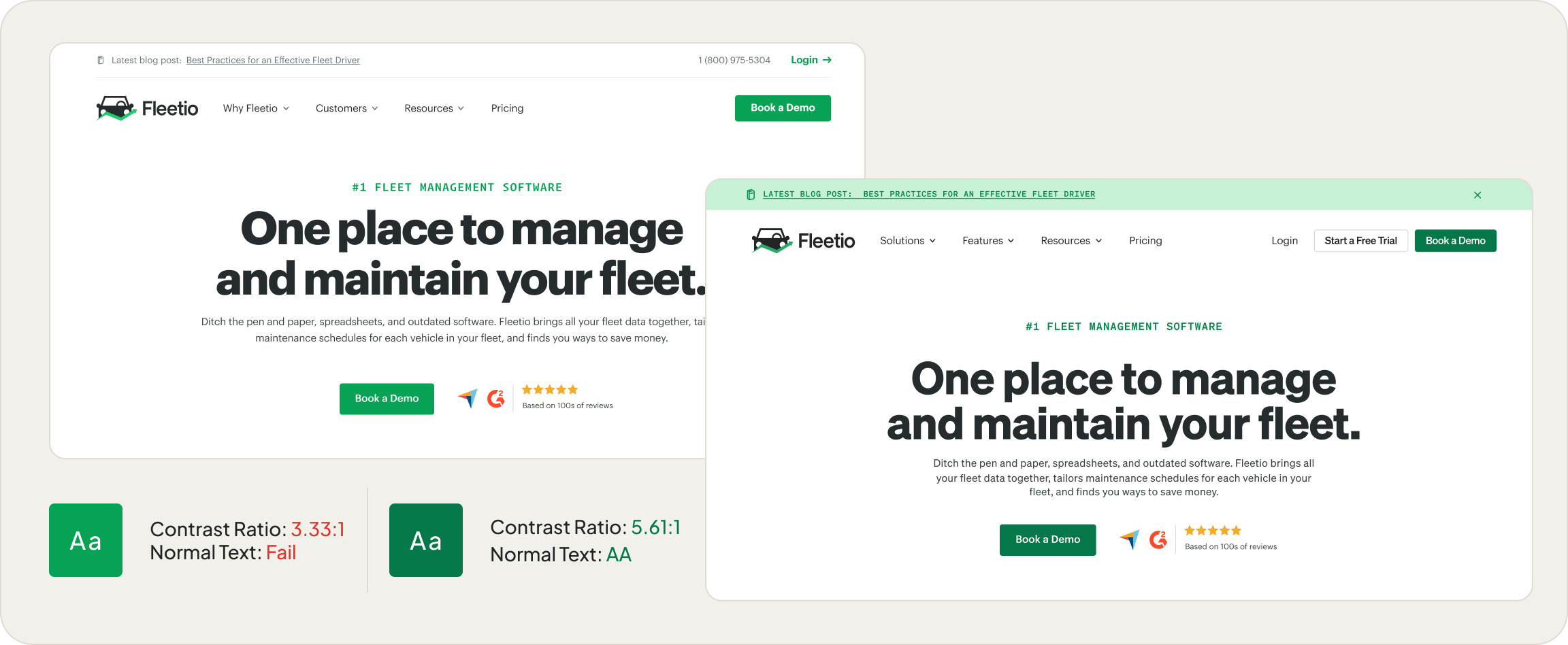
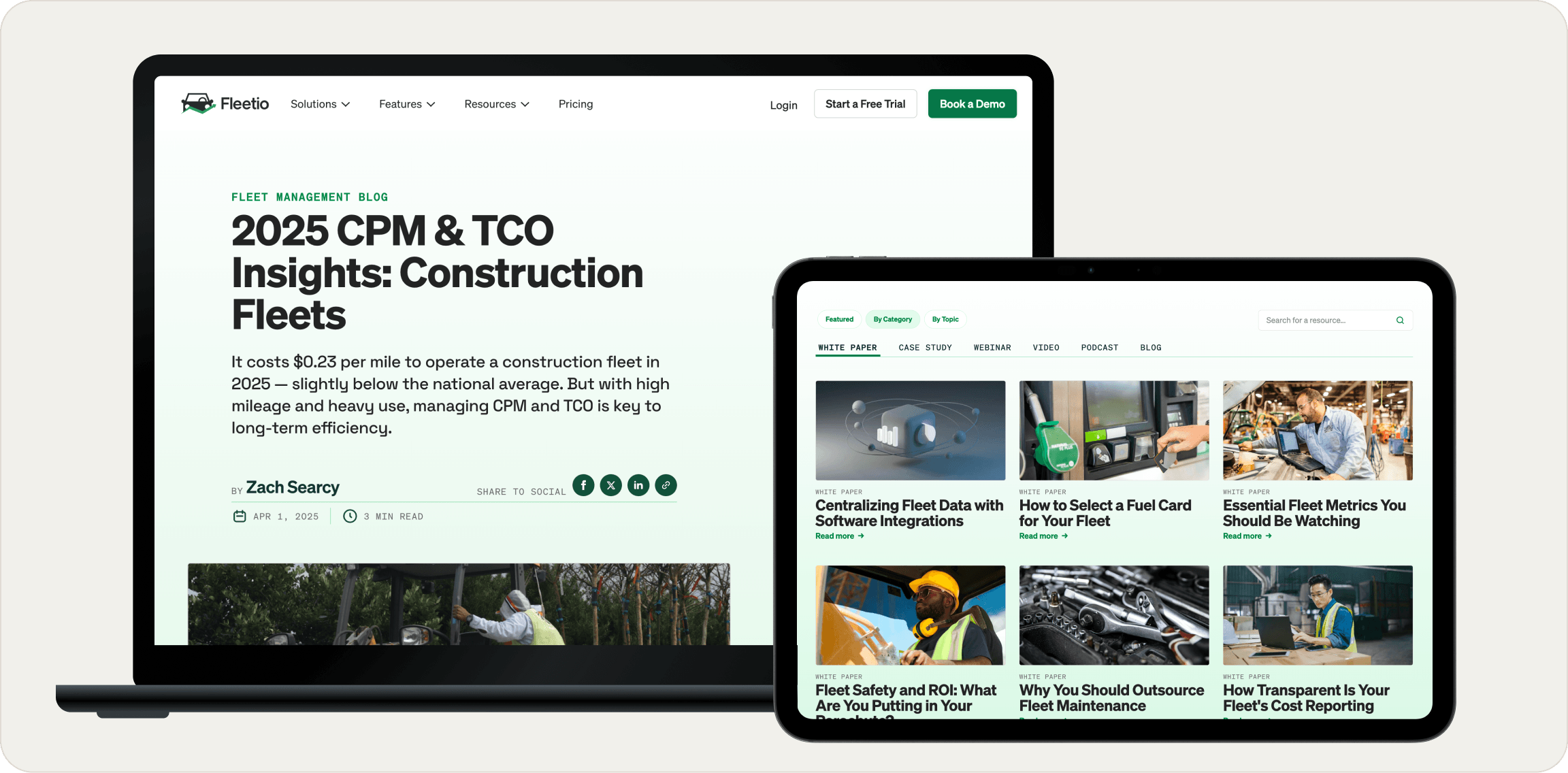
Closing the gap between design and code, one component at a time.
The component library had accumulated inconsistencies over time. Props were named differently across components, variants didn't map to what actually existed in code, and there was no reliable way for engineers to know what a Figma file was really telling them to build. I audited the entire library, standardized prop naming conventions across every component, and rebuilt Figma components to be a true one-to-one mirror of their coded counterparts.
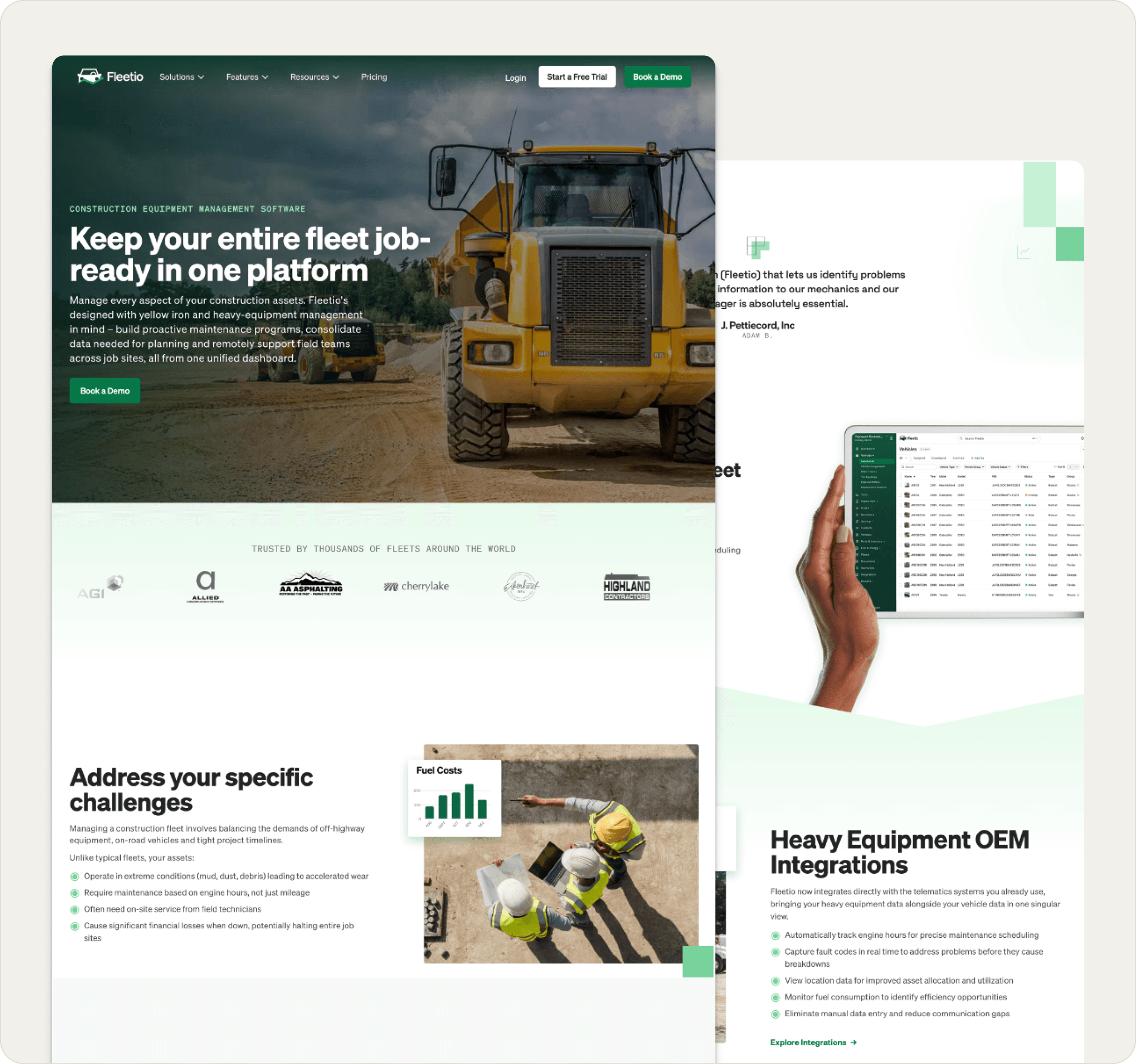
I integrated a Figma plugin linked directly to GitHub so that engineers could surface component code automatically from the design file. I also worked in the codebase during this process, making structural updates to ensure the alignment went both ways. Beyond the audit, I designed and implemented entirely new web components, introduced new visual patterns including mesh gradients, and created templates for surfaces that had never had a system behind them.
const TextCTA = ({ eyebrow, title, button }) => {
  const ctaContent = (
    <div
      className={`relative bg-white overflow-hidden
        max-w-4xl p-6 mx-auto border border-gray-100
        rounded flex flex-col md:items-center
        md:justify-between md:flex-row
        transition-transform ease-in-out
        hover:-translate-y-1`}
    >
      {/* Gradient half-circle background */}
      <div
        className="pointer-events-none absolute
          left-1/2 -bottom-8 -translate-x-1/2
          w-[900px] h-[400px] z-0"
        style={{
          background: `radial-gradient(
            78.44% 59.77% at 50% 100%,
            #C7F1D5 0%, #FFF 70%
          )`,
          filter: 'blur(50px)',
        }}
      />
      <div className="md:mr-12 z-10 relative">
        <p className="eyebrow">{eyebrow}</p>
        <h2 className="h3"
          dangerouslySetInnerHTML={{
            __html: title.replace(/\n/g, '<br />')
          }}
        />
      </div>
      <div className="flex whitespace-nowrap z-10">
        <Button {...button} arrow />
      </div>
    </div>
  );

  return button?.href
    ? <Link href={button.href}>{ctaContent}</Link>
    : ctaContent;
};Building the components I designed — and designing the ones I built.
My role at Fleetio wasn't just design. I worked directly in the Next.js codebase alongside engineers, writing production React components styled with Tailwind CSS. When I designed a new component in Figma, I also wrote the front-end implementation — ensuring that what shipped matched the design file exactly, with every prop, variant, and interaction state accounted for.
I built reusable components like the TextCTA shown above, where small details matter: the radial gradient that shifts on hover, the responsive layout that adapts from stacked to inline, the conditional Link wrapper. I also integrated AI tools like Claude Code and Codex into my workflow to accelerate component development and automate repetitive design-to-code translation tasks, reducing turnaround from days to hours.
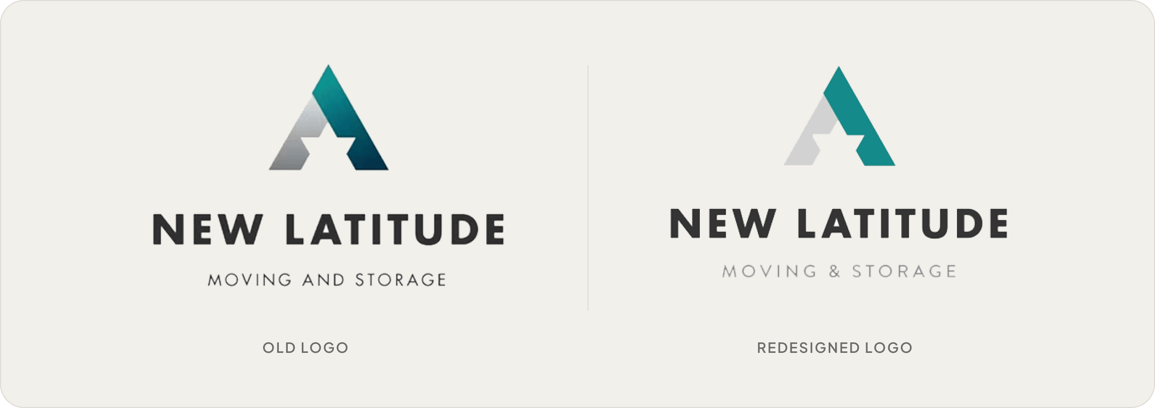
At Move & Store, I rebranded three distinct companies from the ground up, building design systems across web, email, ads, and social where none had existed before.

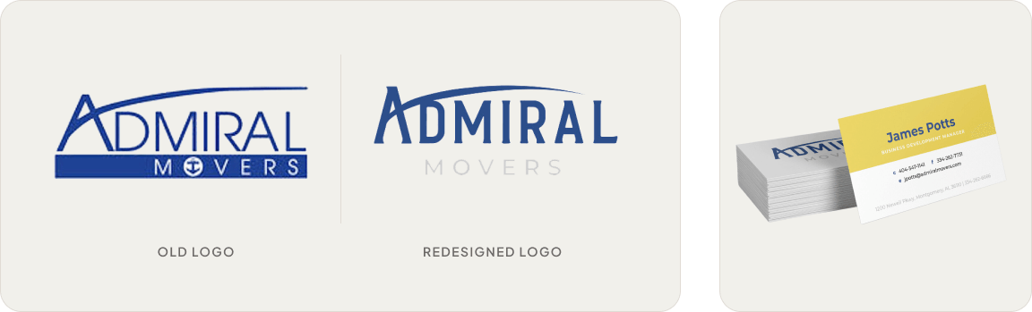
Three brands. Three blank slates. One designer.
Move & Store was growing through acquisition, and each new brand came with no visual system, no consistency, and no foundation to build on. New Latitude Movers and Admiral Movers each needed their own identity that could stand on its own while being built with the same level of craft and intention.
I led and executed every aspect of the work myself, combining design and photography skills to build each brand from scratch across every surface. The result was three distinct, cohesive identities that looked nothing like each other and everything like a brand that knew exactly what it was.
At Platypi, I found my footing as a designer, learning to translate client ideas into polished brand identities and websites across a wide range of industries.
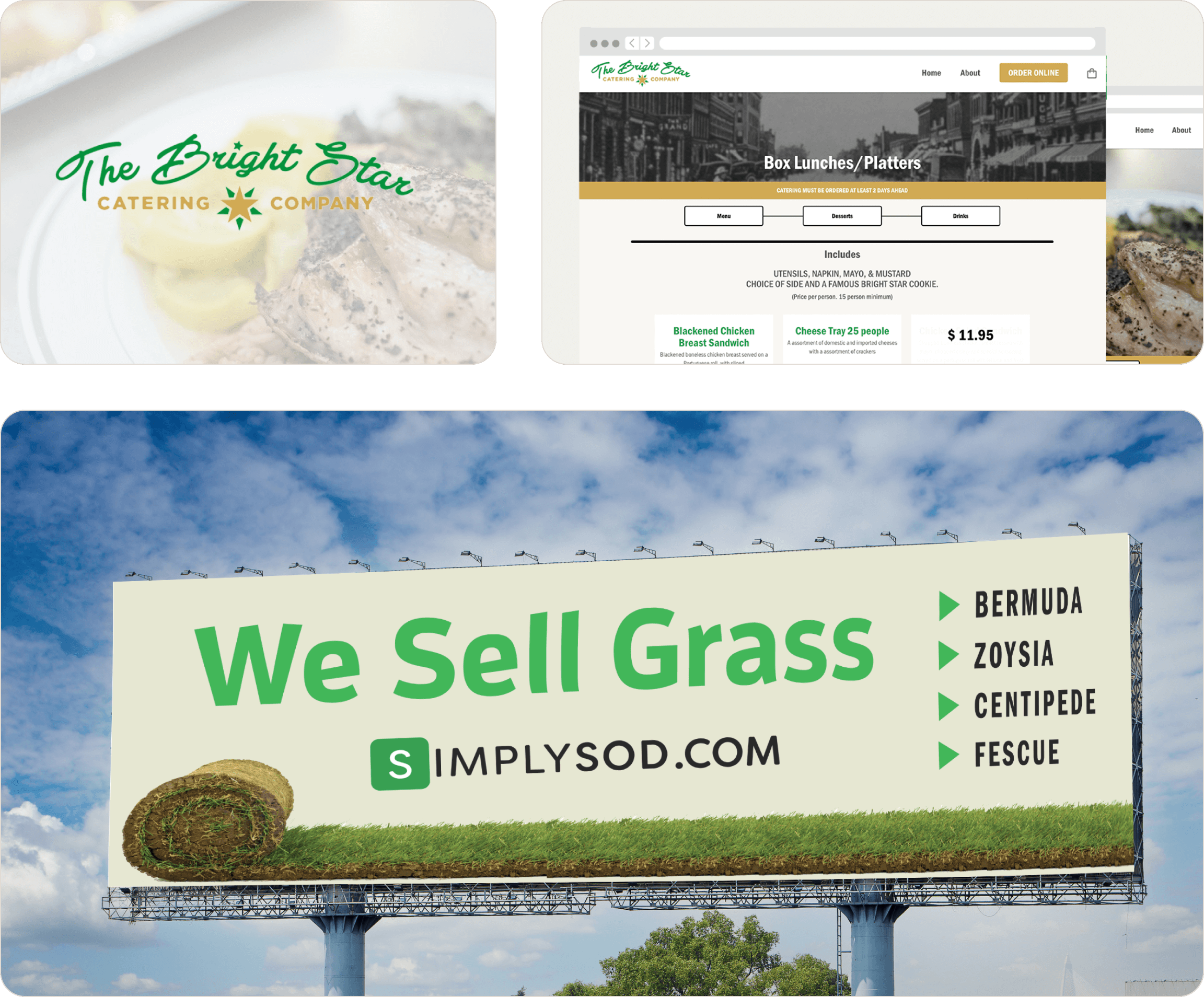
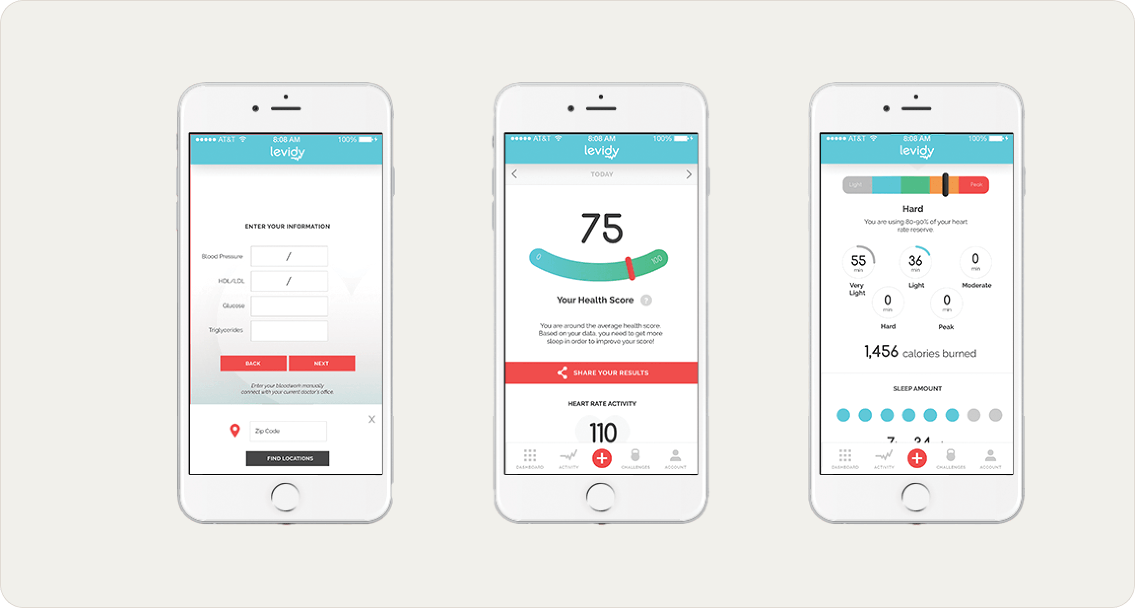
My first clients. My first websites. Where it all started.
Platypi was where I learned what it actually means to work with clients. Taking a brief, asking the right questions, and turning someone's vision into something real and designed with intention. The work spanned industries and formats, and no two projects looked alike.
It was also where I built my web design foundation. Designing for real products with real constraints pushed me to think beyond aesthetics and start solving problems with design, a skill that has shaped everything I've done since.